Chocoberry Cafe
____
To commemorate my parents and Korean roots, this is a personal branding project on my parent's special Korean coffeeshop, Chocoberry Cafe.
I tasked myself to do a brand refresh on Chocoberry Cafe. I came up with the vision of the coffeeshop.
"Your go-to spot for K-cute vibes, delicious Korean treats, and unforgettable moments. Immerse yourself in Korean culture with our sweet treats and chill atmosphere. Indulge in authentic Korean desserts like our signature Bap Bing Soo while snapping selfies in our vibrant space. Escape the ordinary at our Korean fusion cafe. Enjoy delicious treats, create lasting memories, and experience the heart of Korean culture."
This was the original logo I designed over 10 years ago. The mascot doesn't have a specific persona and the style was pretty outdated and came off very childish. I decided to showcase Chocoberry Cafe's signature dish, Bap bing soo as the main mascot for the branding identity. Below are examples I drew inspiration from.
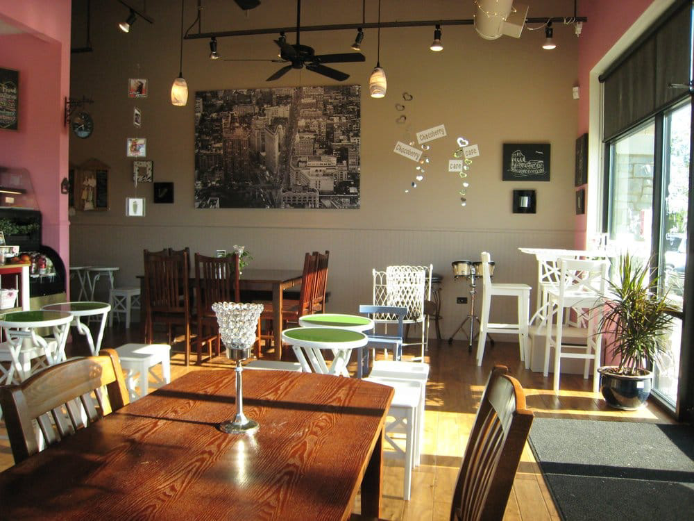
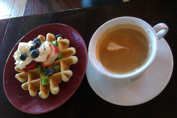
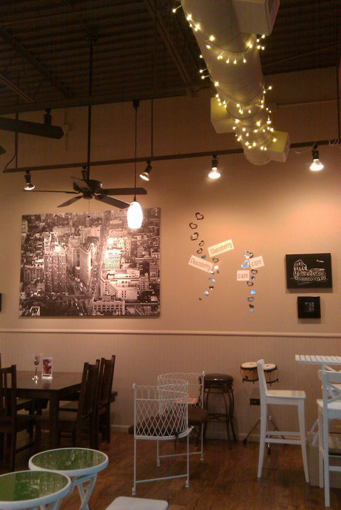
Here are few photos from Chocoberry Cafe. It had that inviting atmosphere. I envisioned this location to be a fun, colorful, vibrant, and chill place where people of all ages can try Korean desserts, place to feel at home, or simply a place where they can work on art projects and study.
Below are few logo sketches and concepts that showcased Bap Bingsoo mascot as the logo for Chocoberry Cafe. I showed the first design to my client and design peers and they agreed that the round shape resembled ice cream scoop more. I added texture for the shaved ice feel and made it more lumpy to convey the dessert more closely. The dripping look of the dessert looked unique and fun as well, so I added that element as well.
The original colors were beige, pink and brown. The client and I wanted the rebrand to be something more fun yet sophisticated. I picked pink and teal as that drew more contrast to the brand while keeping it fresh and bubbly.
